

I still remember the afternoon I stood in the paint aisle, holding a strip called “Whispering Peach” in one hand and “Grey Mist” in the other, feeling completely paralyzed. I had no idea how to pick colors that would actually work together once they hit the walls. That moment taught me something important: choosing a color palette isn’t about finding one magic shade – it’s about building a small system of tones that make a room feel like a whole thought, not a collection of guesses.
Since then, I’ve spent years learning why certain color schemes make you breathe deeper the second you walk into a room, and why others leave you restless without knowing why. This guide is the conversation I wish I’d had back in that aisle. We’re going to walk through the practical side of colors – from the psychology behind them to the exact tools you can use – so that when you’re ready to choose color palette choices for your own space, you’ll do it with confidence, not second-guessing.
Why a Cohesive Color Palette Feels Like Home
Before we touch a single swatch, let’s name the feeling you’re chasing. A room with cohesive colors doesn’t shout at you. It pulls things together so gently that the sofa, the rug, the curtains, and even the lamp suddenly belong to the same family. This is what designers mean when they talk about a cohesive color scheme – a thread of visual logic that runs from the entryway to the back bedroom.
But does that mean you have to ask yourself, should your whole house have the same color scheme? Not in the literal sense of painting every wall the same shade. Instead, think of it as building a cohesive color palette that allows rooms to feel connected without feeling identical. You might use a soft clay tone in the living room, then carry a muted version of that into the hallway trim. The goal is to create an appealing colors sequence that flows, not a rigid rule that gets boring. When you get this right, guests won’t necessarily notice the technique – they’ll just say your home feels really good.
That underlying harmony is what separates a random selection of colors from a real color palette for home living. It’s also why the question “what should i color?” shows up in your head long before you’ve even opened a paint tin. You’re not just picking a shade; you’re making a promise about how you want to feel every morning.
What Is a Color Scheme – and Why the Definition Matters
If you’ve ever found yourself scrolling Pinterest at midnight, you’ve probably bumped into the phrase what is a color scheme more than once. Let’s get the color scheme definition crystal clear right now so we’re working from the same toolbox.
A color scheme is simply a planned set of colors chosen to create a specific mood or visual effect within a space. Think of it as the DNA of a room’s color story. When someone talks about different color schemes, they’re referring to the various formulas you can follow – like staying within one hue family or deliberately pulling opposites from the color wheel. The color scheme definition isn’t academic fluff; it’s the difference between a room that feels intentional and one that looks like a sample sale exploded.
There are many types of color schemes, and each brings a completely different energy. A monochromatic look gives you serenity; a complementary pairing gives you tension and life. To understand the range, it helps to look at color scheme examples that show how theory actually lands on walls. For instance, a monochromatic colors approach – where you work with varying tints and shades of a single hue – is one of the most calming color scheme ideas you can adopt. I once helped a friend build a bedroom entirely around monochromatic colors of washed blue, from a deep slate bed frame to pale linen curtains, and the effect was like walking into a quiet exhale.
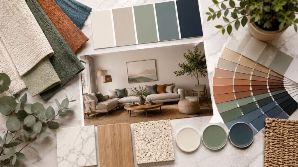
Of course, not all color scheme examples play it safe. Some of the most memorable interiors come from understanding different color schemes well enough to bend them. When you study the full set of types of color schemes – monochromatic, analogous, complementary, split-complementary, triadic – you start to see them not as rules, but as jumping-off points.
The Designer’s Toolbox: From Adobe Color to the Color Palette Generator
When I first started experimenting with colors, I assumed professionals just had a magical eye for what works. Some do, but many rely on digital tools that do the heavy lifting. These tools have made the process of choosing a color palette something you can do from your phone while waiting for coffee.
One of the most well-known platforms is Adobe Color (formerly Kuler). The online community often refers to it as adobe colors, and it’s one of the smartest ways to explore the relationship between tones. With adobe color, you can extract harmonious palettes from an uploaded photo – say, a snapshot of a sunset you took on vacation – and immediately see how those tones translate into a workable color palette. If you’ve ever used adobe colors in conjunction with Photoshop or Illustrator, you already know how fluid that integration is.
Another heavyweight is Coolors, a color palette generator that’s almost addictive. You hit the spacebar and it generates fresh, well-balanced color palettes in real time. When you’re stuck, a good color palette generator like coolors can unlock combinations you’d never think to try. It’s one of the fastest ways to build color palettes that feel designed rather than accidental.
If you’re someone who likes to see palettes curated by a community, Color Hunt is a goldmine. On color hunt, you’ll find countless four-color groupings submitted by designers around the world. I regularly use color hunt to kickstart mood boards; it’s especially helpful when I need pastel colors that don’t tip into baby-shower territory. A well-tuned set of pastel colors can bring a soft, modern warmth to a kitchen or nursery without feeling saccharine.
The Canva color palette generator is another option that lives right inside the design platform. The canva color palette generator lets you pull a palette from any image and then instantly apply it to your design project. It’s an excellent bridge between digital mockups and real-life paint selection.
Even a font generator can surprisingly play a role in your color journey. A good font generator lets you preview how your typography interacts with your chosen background hues; if you’re creating a digital vision board of your room, testing text against your color palette can reveal contrast issues you’d otherwise miss.
I’d also love to note that the international design community uses terms like paleta de cores (Portuguese for color palette) and circulo cromatico (the color wheel) constantly. When browsing inspiration from Brazilian designers, you’ll often see cores used beautifully in context – paleta de cores and circulo cromatico aren’t just vocabulary; they’re gateways to seeing how cores function in another culture’s design language.
The Home as a Canvas: How to Choose Color Palette Selections That Last
This is the part where theory meets drywall. The question “how to pick colors” is deceptively simple, but it hides layers of decision-making. Most people actually start by wondering how to choose color palette for home spaces, and that’s the right instinct. When you figure out the big-picture palette, individual room choices become far easier.
So, how to choose a color palette for your home without losing your mind? The first step is to notice the fixed elements: flooring, large upholstery pieces, countertops, and the amount of natural light each room receives. These are your anchors. A practical process for choosing a color palette always begins with what you can’t change, then builds outwards. When a client asks how to pick a color palette for your home, I ask them to gather a few physical objects that already live in the space – a ceramic bowl, a favorite cushion, a piece of art – and we pull the palette right out of those.
To choose color palette options that you won’t tire of, limit yourself to three to five core tones for the main living areas. That’s your color palette for home foundation. From there, you can vary the proportions room by room. For example, your home color palette might center on warm taupe, sage, and cream; in the kitchen, you dial up the sage, while in the study, taupe takes the lead. This is how you create a unified set of interior color palettes that still allows each room its own character. Resources that focus on house color schemes interior guidance often repeat the same golden rule: repetition with variation. That’s how professional interior design color schemes achieve the feeling of flow without monotony.
The final layer is editing your selection of colors so that nothing feels like an afterthought. When you choose color palette finalists, step back and ask whether the grouping feels like it belongs together. If your appealing colors checklist includes a pop of unexpected energy, that’s great – just anchor it with neutrals that let the accent breathe. And remember, a truly successful choosing a color palette process means testing swatches in the actual light of the room at different times of day. Natural light reveals undertones that the shop lighting hid.
Good Color Combos That Designers Actually Use
I’ve collected so many good color combinations over the years that I keep a folder on my phone just for paint-chip snapshots. But let’s move beyond the obvious and talk about good color combos that do something emotional.
A few of my personal favorite good color combos: dusty rose with a deep charcoal blue; warm ochre with milky off-white; and a trio of sage green, burnt orange, and cream that feels earthy without being heavy. These cute color combos aren’t just for nurseries or coffee shops; I’ve seen cute color combos work beautifully in a modern living room when paired with black metal accents.
When we talk about the best colour combination choices, it’s important to look at heritage paint brands that specialize in curation. The farrow and ball colour schemes are practically a graduate course in restraint. Farrow and Ball has built a reputation on shades that shift in the light, and their pre-selected colour schemes take the guesswork out of the equation. Studying farrow and ball colour schemes can teach you a lot about how to combine muted greens with warm greys, or how a soft plaster pink can ground a dining room. It’s no surprise that their colour schemes are often pinned as the best colour combination references for period homes.
I also find myself drawn to certain colour schemes because of how they handle light. The best colours for a north-facing room are those that actively counteract the cool light – warm biscuit tones, soft yellow-based neutrals, even a deep, welcoming terracotta. When searching for the best colours, don’t just look at the swatch; imagine the colour bouncing off your walls at 5 p.m. on a winter evening.
Any colour combination that feels timeless tends to have a quiet dialogue between warm and cool. A home colour combination I return to often is pale olive with warm ivory and a hint of brushed brass, which translates into a colour combination that works across both traditional and contemporary interiors. A related house colour combination that reads as sophisticated yet cozy pairs a blue-grey wall with walnut furniture and linen tones. This particular house colour combination has become the signature of many a design-studio portfolio, and for good reason.
When you browse through galleries, you’ll spot a thousand takes on color combination theory, but the ones that stick rely on restraint. The most memorable color combination is often the one that lets a single unusual tone do the talking. You don’t need equal weight for every colour; you need a color scheme where one voice sings and the rest harmonize. That is the heart of every beautiful color scheme I’ve ever loved.
For those who prefer the British spelling, the internet is full of excellent colour scheme inspiration. A well-executed colour scheme takes into account textiles, lighting, and even the view from the window. It’s why a colour scheme drawn from a garden view can feel so effortlessly right.
Building a Cohesive Color Palette Across an Entire Home
One of the most common dilemmas I hear is whether the entire house needs to stick to one same color scheme. The short answer: not the same color scheme, but a related one. There’s a big difference between a cohesive color scheme that repeats a handful of key tones and a monotonous one that never shifts. When people ask should your whole house have the same color scheme, what they’re really asking is how to avoid chaos. You can absolutely have a cohesive color palette that adapts through saturation and temperature as you move through rooms. You’ll see this in the best interior design color schemes – they link spaces without suffocating them.
To build a set of house color schemes interior designers swear by, start with a neutral thread that can weave through the whole home. That’s your home color palette spine. Then, for each room, you pull in a secondary colour from your overall color palette for home scheme. If your home color palette includes sand, seagrass green, and rust, your bedroom might be predominantly sand and green, while the dining nook leans into rust and sand. The beauty of well-planned interior color palettes is that they give you freedom within a framework.
Using a color palette generator can help you visualize this at the planning stage. Whether you prefer coolors, adobe color, or the canva color palette generator, running your core colours through a color palette generator will show you how tints, shades, and complementary accents can branch off from your base. Once you see those color palettes laid out digitally, it becomes much easier to make confident choosing a color palette decisions. You start to see that a selection of colors curated across a home doesn’t have to be rigid; it just needs a few repeat characters. And when you choose color palette threads that already appear in your art or textiles, the whole house starts to feel like it was orchestrated, not decorated.
When I work on a full-home project, I always ask the client the playful version of “what should i color?” as we walk through each space. It’s a way of finding the emotional anchor. The answer might be “the kitchen should feel like a warm loaf of bread” – and from that, we pull our appealing colors and build the room’s expression. These repeated rituals for choosing a color palette are what turn a house into a personal sanctuary.
Deep Dive: Interior Design Color Schemes That Feel Like You
What I love about great interior design color schemes is that they’re never just about the walls. The best color scheme ideas layer paint, textiles, art, and even the spines of books into the conversation. You can find color scheme examples in the most unexpected places: a striped blanket, a patterned tile, a market tote. Taking a picture of something that already makes you happy and running it through a color palette generator is one of the quickest ways to generate good color combinations that actually reflect your personality.
If you’ve been hesitant about stronger color scheme ideas, consider a dusty primary palette – muted red, denim blue, and soft yellow – and tone it way down. You’ll end up with cute color combos that feel playful but mature. In fact, many of the color scheme examples I save involve just two statement colours and a generous dose of warm white.
For readers who speak Portuguese, you’ll find that paleta de cores is a term loaded with the same nuance as in English. A beautifully balanced paleta de cores can elevate even a room furnished simply. Studying the circulo cromatico helps you see why certain pairs vibrate and others soothe. The circulo cromatico is an invaluable tool for understanding complementary and analogous relationships, and paying attention to cores that sit opposite each other on the wheel can spark some of the most dynamic color palette choices. Once you train your eye to notice how cores play off one another in natural light, you’ll start to see every room as a living colour study.
Practical Answers for the Things We Actually Google
FAQ
What exactly is a color scheme?
A color scheme is a deliberate selection of colors used together to create a particular mood or visual effect. The color scheme definition covers everything from monochromatic groupings to triadic combos, and seeing color scheme examples helps the idea click faster than any written description.
How do I pick a color palette for my whole home?
When you’re figuring out how to pick colors that work house-wide, start by choosing three to five core tones. Then use how to choose color palette for home methods like pulling hues from a favorite rug. If you follow a clear how to choose a color palette for your home process, you’ll end up with a cohesive color palette that feels connected without being identical. Many guides on how to pick a color palette for your home recommend physically taping swatches in each room to see how light changes them. This choose color palette practice alone can save you from expensive mistakes. Ultimately, choosing a color palette is about observation and restraint, and a thoughtful selection of colors transforms a house into a home. That’s what makes the color palette for home such a personal creative act.
Are there tools that can help me create a palette?
Absolutely. Platforms like Coolors, Adobe Color, and Color Hunt act as a digital color palette generator. The canva color palette generator and community-curated color palettes on color hunt are also brilliant for sparking ideas. Even a font generator can help you test contrast when mocking up a room digitally – a font generator lets you see whether your text-based art or signage will pop against your chosen color palette. And terms like paleta de cores and circulo cromatico remind us that colour theory is a global language, and understanding how cores interact through the circulo cromatico gives you a universal skill set.
How do I find the best colour combinations for my home?
Look at trusted farrow and ball colour schemes, and study their colour schemes for inspiration. The best colour combination often comes from layering a single prominent hue with supportive neutrals. If you’re after the best colours for a cosy atmosphere, look at how a well-crafted colour combination plays warm and cool against each other. A home colour combination like soft plaster pink with deep teal trim yields a colour combination that feels personal and rooted. For exteriors, a house colour combination that balances stone, siding, and trim can make a massive impact, and when you test any color combination in natural light, you’ll see the undertones that ultimately make or break the look. The most enduring color combination is never trendy – it’s one that makes you feel at ease the moment you walk through the door.
A Few Final Brushstrokes
Working with colors is a practice, not a one-time decision. You’ll change your mind, the light will shift through the seasons, and your color palette will likely evolve. That’s not a failure – it’s a sign that you’re paying attention. Whether you’re deep in a coolors session at midnight or holding a swatch against the wall while your coffee goes cold, you’re in the middle of a creative act that shapes how you experience your own daily life.
Trust your eye, lean on the tools, and remember that the most beautiful color schemes are the ones that make you want to stay a little longer.